
But What Does the Data Say? Universal Healthcare
Part 2 of the "But What Does the Data Say?" series

The United States (US) is the only advanced economy (as defined by the IMF) without universal healthcare. While most Americans have supported the policy for over a decade, legislation never seems to appear on the President’s desk. In fact, it has all but disappeared from the Democratic Party platform. Critics of universal healthcare from both parties claim this is a blessing in disguise. Pundits, politicians, and other political commentators insist universal healthcare would be too expensive, vastly increase our taxes, slow down economic growth, weaken economic freedom, and most importantly lower the quality of our care. But what does the data say?
Methodology
As I explained in my “Hypothesis Testing” article, I’m using a p-value of 0.10 or less for determining if a relationship is statistically significant. This is because the IMF only considers 37 countries considered advanced economies and I want to avoid false negatives. The sample size is lower for some of my charts due to missing data. For example, Andorra and San Marino didn’t have healthcare rankings so the charts involving that metric compared the 35 countries with available data. The amount for Current Healthcare Expenditures per capita is a 20-year average of nominal PPP international dollars. While they’re not adjusted for inflation, all thirty-seven countries are measured over the same period. The rankings and median line still apply. Percentage of GDP is inflation-neutral, which is one of the reasons I posted it alongside the nominal expenditures. Some of the charts I provide show a p-value of zero. While this is mathematically possible, it’s more likely my decision to round the numbers to three decimal places is what’s causing them to show up as “0.000.” My primary goal was not to establish causation, but to determine if relationships existed between two variables frequently compared by critics. Correlation alone is not enough to establish causation, but a lack of correlation is evidence against causation. For example: the lack of correlation between total healthcare spending and economic freedom shown in one of the charts is evidence against healthcare spending making the US less free.
Without further delay, on to the data!
Claim: Universal healthcare would be too expensive
The claim I’ve heard the most from critics of universal healthcare is that we can’t afford it. This is false because we’re already spending the money. In fact, the US spends more money than any other nation on healthcare, both nominally and as a percentage of its GDP!
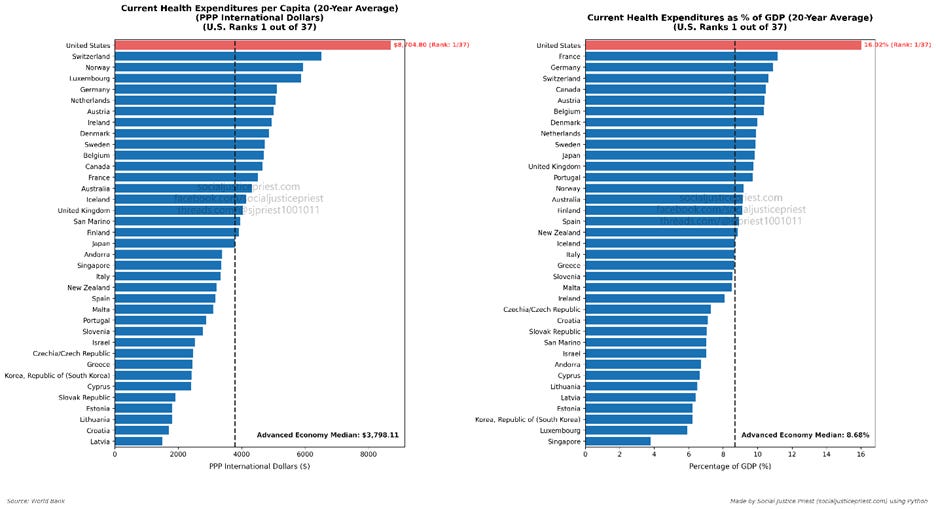
As shown in the graph above, the US spent an average of $8,704.80 or 16.02% of its GDP per year. This is well above the median for all the advanced economies, and no other country comes close in nominal healthcare spending or as a percentage of GDP. Again, we’re the only country without universal healthcare. While this doesn’t prove universal healthcare would be cheaper, no other country paying as much as we do is a good argument in favor of that. In my opinion, the US wouldn’t rank #1 on both the above charts if universal healthcare was more expensive. However, this wouldn’t be a data article if I just relied on my opinion. I verified by examining the data.
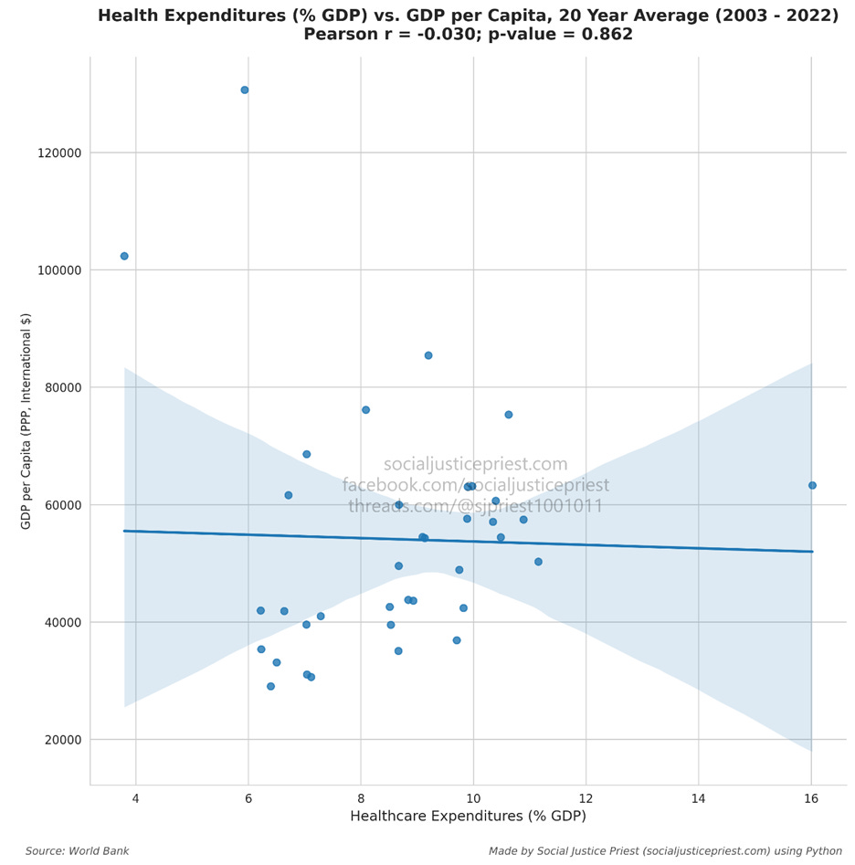
The plot shows no correlation (r = -0.030) between healthcare spending (% GDP) and GDP per capita, meaning there’s no data supporting the claim that universal healthcare is too expensive. As shown by the data, the other advanced economies can afford it despite most of them having smaller GDPs per capita than us (we rank 7/37 using 20-year averages). There’s no reason to believe we can’t.
I can even take it step further by separating government spending and private spending.
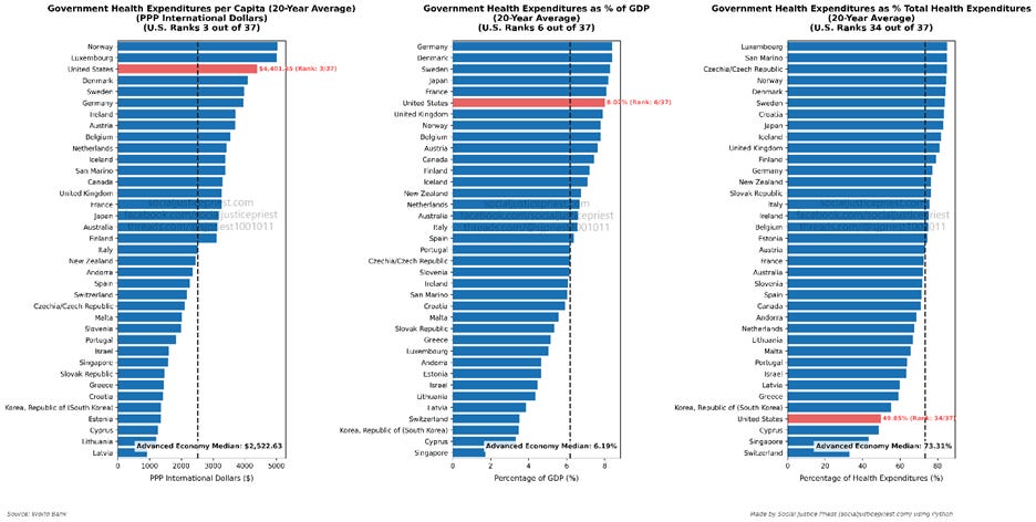
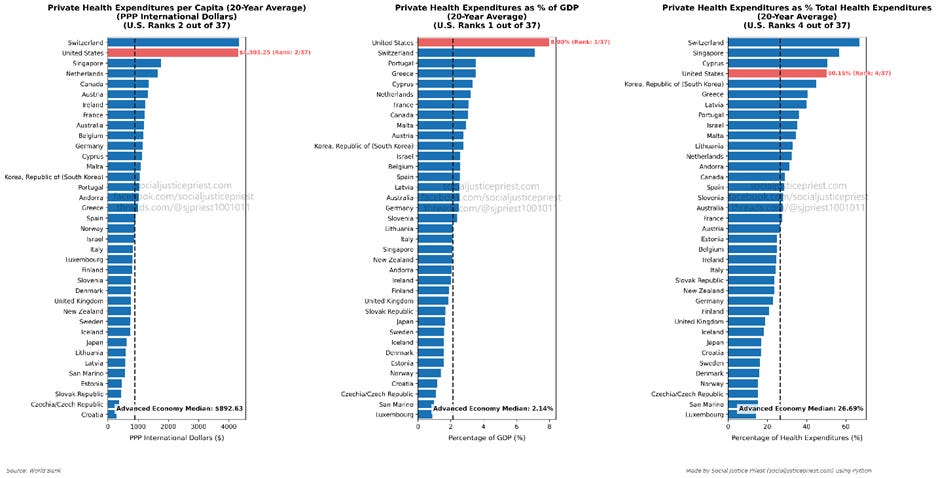
As shown above, a little over half of American healthcare spending is private. Even countries with a higher percentage of private spending spending (like Switzerland) still spend less than we do! Despite only having the fourth highest percentage of private healthcare spending, we still spend the most as a percentage of our GDP and second most in nominal dollars. Critics can’t argue the US spends more because we’re the largest advanced economy because “per capita” controls for population.
Some of the critics will counter this by mentioning that most of these countries have much smaller populations than America. The question I have for them is this: Okay, and? The problem with the population argument is there’s no explanation for why the population matters. Why does America having a higher population than all the other advanced economies mean we can’t implement universal healthcare? If the full argument is “our higher population means universal healthcare would be too expensive,” then the graphs above on healthcare spending and healthcare spending’s lack of correlation with GDP per Capita refute this claim. Countries with Universal Healthcare spend less and have GDPs per Capita both lower and higher than us.
Why do we spend more? Health insurance is based on risk. The people who are lower risk subsidize people who are higher risk. This is known as risk pooling (Blumberg & Giovannelli, 2026). Administering all this risk costs money. So does managing which hospitals, treatments, and medicines an insurance company is willing to cover. In fact, healthcare administration alone costs Americans billions of dollars (Gee & Spiro, 2019). In addition to covering medical treatment and high administrative costs, health insurance companies also need to make a profit. People are not just paying for their medical treatment, risk pools, and administrative costs, they’re also paying to fill the coffers of insurance executives.
Universal healthcare functions the same way, but the government is absorbing some or all the risk. This can be in the form of paying for treatment directly and/or by leveraging its power as a monopsony to negotiate lower prices with insurance companies, pharmaceutical companies, and hospitals. The result is people paying much less even in universal systems that still include private insurance. The citizens pay for it in the form of taxes, which brings me to the next criticism of universal healthcare.
What does the data say about universal healthcare being too expensive? False!
Claim: Universal healthcare will vastly increase our taxes
“Vastly increase our taxes” is a weasel phrase. It means different things to different people and most people can’t/won’t specify what it means to them when I ask. One of the few people who answered my question pointed to countries like Norway and Sweden but refused to provide any more details than that. The reason so many critics rely on weasel phrases like “vastly increase our taxes” is probably because they don’t know what they’re talking about. Most Americans don’t understand how taxes work (Callaway, 2024).
When the people who do understand taxes claim universal healthcare will increase our taxes, they’re usually talking about marginal tax rates. In progressive tax systems, marginal tax rates are brackets set up to tax the higher portions of their income more. For example, let’s assume a country has only two brackets, with the first one topping out at $50K. Any income above $50K is in the second bracket. Someone who makes $100K/year is going to be in a different marginal tax bracket than someone who makes $50K/year, but only for the money they make exceeding $50K. All money they make $50K and below will be taxed under the first bracket. To bring this back to reality, the more tax-savvy critics of universal healthcare here in America argue passing universal healthcare will either increase the tax rates in one or more of our tax brackets or require the creation of new tax brackets. There’s just one big problem: marginal tax rates are a distraction.
As I said in my “Laffer Curve” article, marginal tax rates don’t matter all that much for generating revenue. If we want to know how much people pay, we need to look at effective tax rates (see heatmap below).
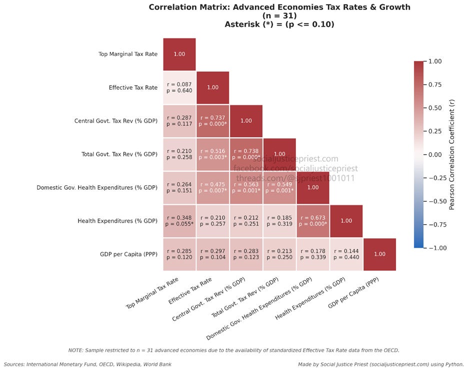
As shown above, there’s positive, statistically significant correlation between effective tax rates and both total (r = 0.516) and central government (r = 0.737) tax revenue. As I stated in my “Correlation vs. Causation” article, causation requires correlation, sequence of events, and no plausible alternative explanation. Both correlation and the earning of revenue coming after taxing make a very strong argument for higher effective tax rates generating more government revenue. Additionally, the heatmap shows statistically significant moderate correlation between effective tax rates and government spending on healthcare (r = 0.348). Critics will argue this must mean the government needs higher taxes to spend more on healthcare, but this relationship lacks sequence. The correlation coefficient can’t tell us if a country’s desire to spend more government funds on healthcare makes it collect more taxes or if collecting more taxes gives it more government money to spend on healthcare. But for the sake of argument let’s assume the critics are right.
If it’s true that countries have higher effective tax rates so they can spend more money on healthcare, that still doesn’t mean the US’s taxes will vastly increase. In fact, it doesn’t mean our taxes will increase at all! To show what I mean, here’s a bar chart showing how our effective tax rates compare to other advanced economies.
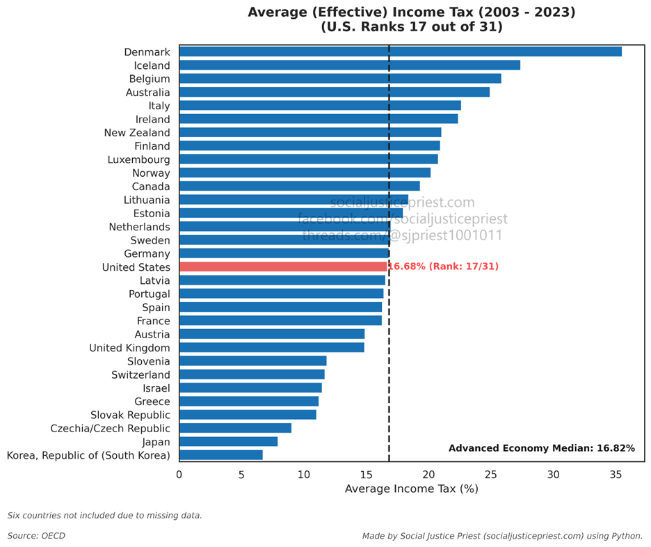
America is in the middle. Every nation below and above us has universal healthcare. If nations with lower tax rates than us can still afford universal healthcare, it means having universal healthcare doesn’t automatically mean we will have higher taxes.
Realistically, however, the US probably will raise taxes to pay for universal healthcare. But what would that really look like? As shown in the graphs above, universal healthcare will likely greatly reduce both public and private spending. Even with the increase in taxes, Americans making $75K a year will save $9000 in medical fees (Flannery, 2026). According to National Nurses United (2024), “even with the tax increase proposed by legislators, 95% of Americans will pay less than they do now. The taxes would replace premiums, co-pays, and deductibles.” As a reminder, over half of our healthcare spending is private. This doesn’t even factor in the extra money gained from stronger bargaining power and fewer cases of job lock. (I go into more detail about all of this in my “Benefits of Universal Healthcare” article.) So even with increased taxes, we’ll still save money.
What does the data say about universal healthcare vastly increasing our taxes? False!
Claim: Universal healthcare slows economic growth
As someone with an MBA, I really don’t understand the point of this criticism. There are quite a few events that can slow a country’s economic growth. Some of these events are bad, but other events are good. Ironically, acquiring a larger GDP/GDP per capita is correlated with economic growth. Known as the convergence hypothesis, poorer countries grow faster than richer ones to “catch up” with the rest of the world (Ravikumar et al., 2024). And many of the other events disappear when economists analyze them over a long enough timeline, like the twenty-year averages I’ve been using. Over that twenty-year period, we’ve had two large recessions, but both are smoothed out by averaging the shrinking in those years with the growth of the others. Yet despite all that, this argument remains one critics continue to bring up.
Let’s start by just looking at the economic growth rates.
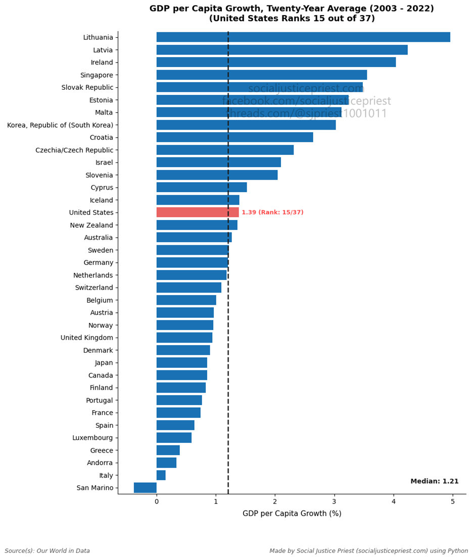
Of the advanced economies, only one country has experienced negative growth: San Marino. The US ranks 15/37. All the countries ranked above and below it have universal healthcare. That’s evidence against the existence of universal healthcare harming economic growth, but how does it look on a heatmap compared to other healthcare spending metrics?
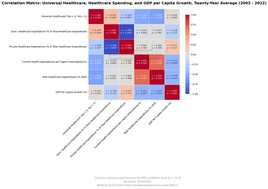
With almost no correlation (r = 0.034) and a very high p-value (p = 0.840), there’s no evidence of a statistically significant relationship between the presence of universal healthcare and economic growth. While I could’ve inferred this from the bar chart, this is about the data and not my inferences. Additionally, universal healthcare has weak positive correlation with government spending on healthcare and weak negative correlation with private spending on healthcare. This makes sense because most universal healthcare programs have more government spending than private spending. Government spending and private spending are inversely proportional to each other, which is why their correlation coefficient is perfectly negative (r = -1.000, p = 0.000). The most interesting part of this heatmap, however, is universal healthcare’s moderately negative correlation with total healthcare spending, both per capita (r = -0.539, p = 0.001) and as a percentage of a country’s GDP (r = -0.591, p = 0.000). As I showed earlier in this article, the US spends the most on healthcare (for inferior results, more on this later) despite not having universal healthcare. The statistically significant relationships shown by the data are a good first step towards arguing universal healthcare is cheaper than the American system.
But this section isn’t about how cheap universal healthcare is, this is about economic growth. I’ve already shown there’s no relationship between universal healthcare and economic growth, but what about how a country spends on healthcare? Critics often argue healthcare impacts economic growth because of the increased government spending on healthcare. The heatmap above shows there’s no statistically significant correlation between government healthcare spending (r = -0.238, p = 0.155), private healthcare spending (r = 0.237, p = 0.157), and economic growth. This is evidence against the increased percentage of government spending associated with universal healthcare slowing economic growth. However, there is a form of spending that is correlated with economic growth: total healthcare spending. Whether the spending is government or private doesn’t matter, but the quantity of it does. Both per capita spending (r = -0.455, p = 0.005) and spending as a percentage of GDP (r = -0.459, p = 0.004) show moderate negative correlation with economic growth. Since America has the highest healthcare spending in both categories, this is the start of a good argument for our current healthcare system being detrimental to economic growth!
What does the data say about universal healthcare slowing economic growth? False!
Claim: Universal healthcare weakens economic freedom
“Economic freedom” is another weasel phrase. When you ask someone what defines “economic freedom,” they will usually say something like “lower taxes” or “less government.” Unfortunately, both are also weasel phrases. Believe it or not, there exist a definition of “economic freedom” widely accepted by economists—two, actually. They are Economic Freedom Index by the Heritage Foundation and the Economic Freedom of the World by the Fraser Institute. Yes, the “Project 2025” people are considered an authority on economic freedom. That’s capitalism for you!
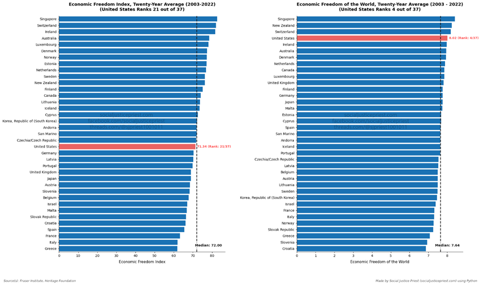
America isn’t first on either of them. Again, having countries above or below us with universal healthcare means having universal healthcare doesn’t automatically lead to less economic freedom. That addresses the generalization, but what does the relationship look like?
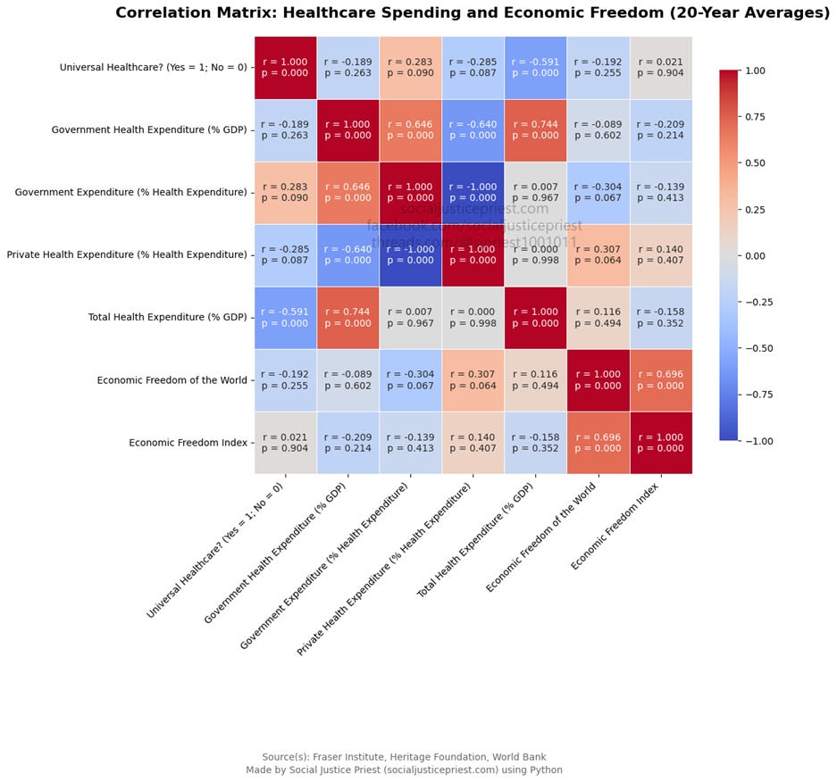
According to the heatmap above, the only three statistically significant relationships between universal healthcare and the six other metrics are government healthcare expenditure (% health expenditure), private healthcare expenditure (% health expenditure), and total healthcare expenditure (% GDP). There is no statistically significant relationship between the existence of universal healthcare and either measurement of economic freedom. In other words, there is no statistical evidence universal healthcare weakens economic freedom.
That said, there are a couple of other interesting parts of this graph. The first is the only statistically significant relationship the Economic Freedom Index has among the healthcare metric shown is with the Economic Freedom of the World. This means not only does the existence of universal healthcare have no impact on economic freedom (as the Heritage Foundation measures it), but healthcare spending doesn’t either. Not even government spending on healthcare has a statistically significant relationship with economic freedom. Despite this, Heritage Foundation often cites economic freedom as justification for opposing universal healthcare. Even using the preferred metric of universal healthcare’s harshest critics, the data shows absolutely no correlation between universal healthcare and reduced economic freedom.
In addition to having statistically significant correlation with the Economic Freedom Index, the Economic Freedom of the World has statistically significant correlation with government healthcare expenditure (% health expenditure) and private healthcare expenditure (% health expenditure). The former has negative correlation and the latter has positive correlation, but correlation is not equal to causality. Just because a relationship exists doesn’t mean private healthcare spending is good for Fraser’s definition of economic freedom and government healthcare having a negative relationship doesn’t mean it’s bad for economic freedom. Regardless, there’s no statistically significant correlation between the Economic Freedom of the World and a country having universal healthcare.
What does the data say about universal healthcare weakening economic freedom? False!
Claim: Universal healthcare lower the quality of our care
Even though I hear this criticism for universal healthcare almost as much as I hear it’s too expensive, I decided to save it for last because it’s the easiest to refute. It also shows just how flawed America’s existing health system is. There are multiple quality metrics associated with healthcare: life expectancy, infant mortality, maternal mortality, and the global ranking of the healthcare system.
Some critics might ask, why aren’t you using the Human Development Index (HDI)? The HDI combines life expectancy with two other measurements not related to healthcare. If a country’s life expectancy is correlated with universal healthcare, it’s likely its HDI will be too. This makes the HDI redundant, but for the sake of being thorough, I will still provide a bar chart showing how America compares.
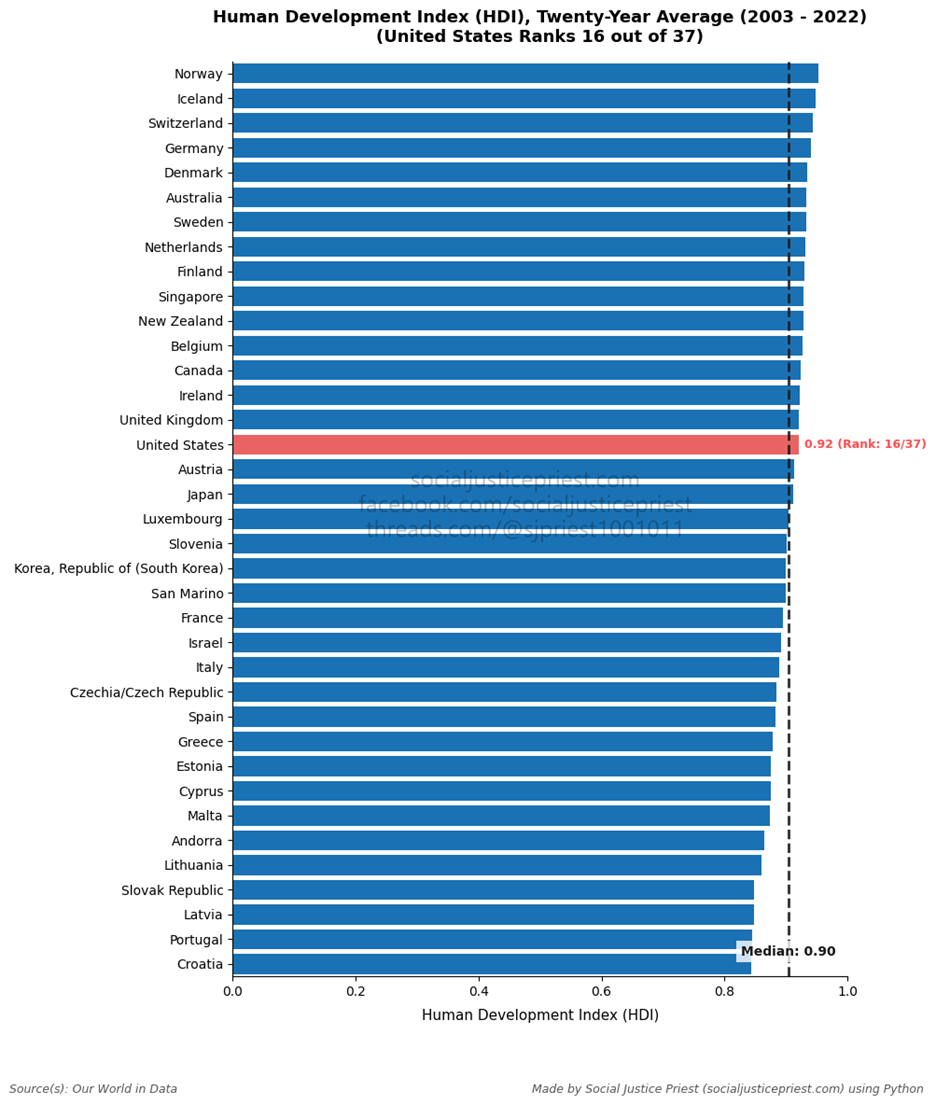
The United States ranks in the upper half on the HDI. While the fifteen countries that surpass it all have universal healthcare, only one metric of the HDI is related to healthcare (life expectancy). That’s why it’s more important to look at the healthcare metrics independently. Before I get to the heatmap, remember the US spends the most on healthcare, but is ranked one of the lowest of all the advanced economies.
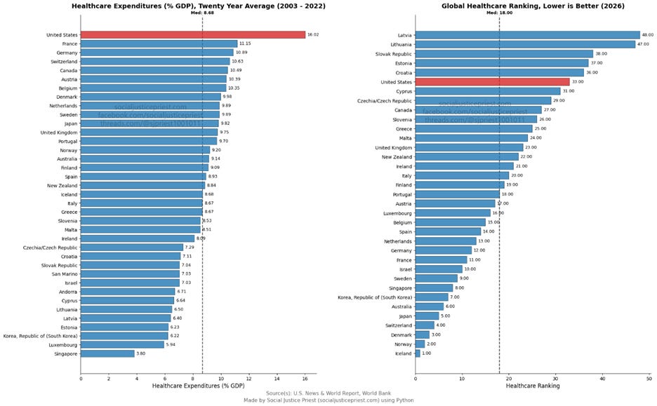
I modified the chart a bit to show the actual numbers related to each country because the Healthcare Ranks are global, but we’re only looking at the advanced economies. Andorra and San Marino (it uses Italy’s system) are missing from the Global Healthcare Rankings chart because they weren’t ranked by the original source, U.S. News & World Report. While the US isn’t the lowest ranking healthcare system among the advanced economies, we’re getting a bad deal for what we’re spending. Again, I can give my opinions all day, but that’s not what this article is about.
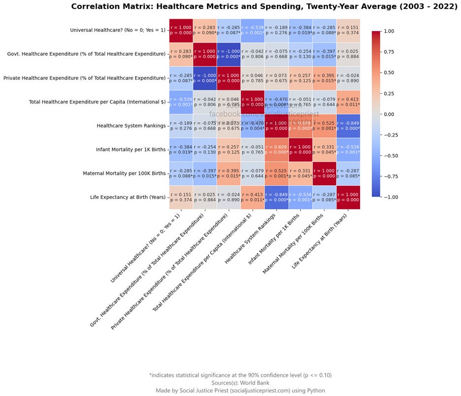
Plenty of numbers to point out in this one! I’ve already covered most of the spending numbers of above, but both infant (r = -0.384, p = 0.019) and maternal (r = -0.285, p = 0.088) mortality are moderately negatively correlated with universal healthcare. While this doesn’t prove universal healthcare causes lower infant and maternal mortality rates, the lack of positive correlation is evidence against universal healthcare being detrimental to these metrics.
There’s no correlation between life expectancy and universal healthcare. While critics of universal healthcare may argue this is a win for them, what it really means is no argument can be made for America’s strictly for-profit system allowing us to live longer.
Before I get to healthcare rankings, I want to take another quick look at healthcare spending. Total healthcare spending is positively correlated (r = 0.413, p = 0.011) with life expectancy. This is true despite America spending the most on healthcare and having one of the lowest life expectancies of the advanced economies. This makes a great argument for America’s for-profit healthcare system being the exception (in a bad way) and not the rule. Spending more money on healthcare could lead to longer lifespans if the healthcare system isn’t guided by profits. There’s another metric correlated (r = -0.470, p = 0.004) with total healthcare spending: healthcare system rankings.
For Healthcare Rankings, a lower rank is better (e.g. #1 is better than #25) so the correlation coefficients for good and bad relationships will be reversed. For example, correlation coefficient for Total healthcare spending and healthcare ranking being negative means there’s evidence of a relationship between more total spending on healthcare and higher quality treatment. Neither the proportion of government nor private healthcare spending have any impact on where a healthcare system ranks, showing it’s more about how the money is spent vs. who spends the money. Infant (r = 0.609, p = 0.000) and maternal (r = 0.525, p = 0.001) mortality are both positively correlated with healthcare rankings. While it shocked me at first, I remembered lower ranking systems have larger numbers. Life expectancy is the opposite. The number increasing as the healthcare rank decreases is good. With the exception of government and private spending, healthcare rank and life expectancy (r = -0.849, p = 0.000) have the strongest statistically significant relationship on the entire chart!
We can talk about costs, taxes, growth, economic freedom all day long, but at the end of the day healthcare is about saving lives and improving the quality of life. Compared to most other advanced economies, America fails in that regard. Even among the countries our healthcare system technically outranks, we still lose to most of them in maternal and infant mortality.
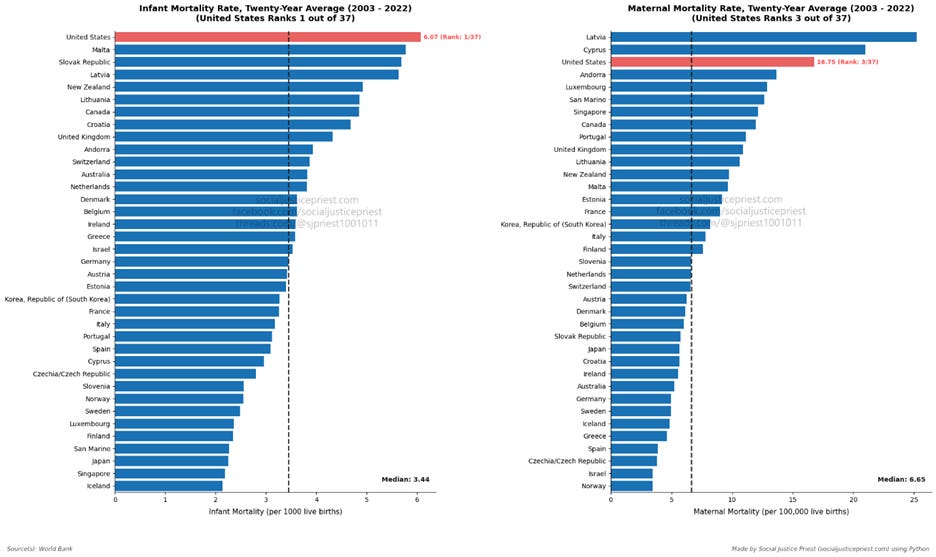
What does the data say about universal healthcare lowering the quality of our care? False!
Conclusion:
When comparing the advanced economies, the data doesn’t support any of the most common criticisms of universal healthcare. Some people will push back on this by trying to say, “But you said correlation doesn’t equal causality so how does this mean anything?” Yes, correlation doesn’t equal causality, but I haven’t been trying to establish causality. In fact, quite the opposite. As I said at the beginning of this article, correlation is a necessary first step towards causality. The lack of statistically significant correlation supporting these criticisms of universal healthcare is evidence against them being true. If critics want to continue to argue universal healthcare would be bad for America, they’re either going to need to find better data or better arguments.
This article addressed the most common criticisms of universal healthcare using hard data. To find out how universal healthcare would benefit America from a socioeconomic perspective, check out my other article, “The Benefits of Universal Healthcare.”
Sources:
Blumberg, L. J., & Giovannelli, J. (2026, March 11). What health insurance risk pooling is, and why it’s key to maintaining affordability. The Commonwealth Fund. https://www.commonwealthfund.org/publications/explainer/2026/mar/health-insurance-risk-pooling-key-maintaining-affordability
Callaway, Z. (2024, May 29). National tax literacy poll: Understanding the tax code. Tax Foundation. https://taxfoundation.org/blog/national-tax-poll-understanding-taxes/
Flannery, M. E. (2026, May 12). The education case for single-payer healthcare systems. NEA. https://www.nea.org/nea-today/all-news-articles/education-case-single-payer-healthcare-systems
Gee, E., & Spiro, T. (2019, April 8). Excess administrative costs burden the U.S. Health Care System. Center for American Progress. https://www.americanprogress.org/article/excess-administrative-costs-burden-u-s-health-care-system/
National Nurses United. (2024, September 9). Flyers. Medicare For All. https://medicare4all.org/flyers-2/
Ravikumar, B., Chinagorom-Abiakalam, D., & Smaldone, A. (2024, August 16). Convergence or divergence? A look at GDP growth across richer and poorer countries. Federal Reserve Bank of St. Louis. https://www.stlouisfed.org/on-the-economy/2024/aug/convergence-divergence-gdp-growth-richer-poorer-countries
The sources for the data are provided on the charts/graphs themselves.
Enjoying my content?