
Logic Lessons: Correlation vs. Causation
Lesson 3

Note: I was originally going to save this one for later in the “Logic Lessons” series, but I think it’s important to discuss this topic for my upcoming “But What Does the Data Say?” series.
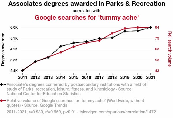
Most reading this have likely seen a graph like the one above. Two obviously unrelated events moving together over a set period of time. These kinds of graphs are made to teach an important lesson: correlation isn’t causation. While this simple takeaway is a good heuristic, the math is more complicated than that!
What is correlation?
Correlation is the measure of how well two variables move together over a certain period of time. Data analysts, economists, mathematicians, etc. measure correlation on a scale from -1 to 1. This is a decimal known as the correlation coefficient (r). Positive values mean the variables move in the same direction. Negative values mean they move in opposite directions. Values close to zero mean they don’t move together at all. In other words, no correlation. In the example above, the two variables, Parks & Recreation Degrees and Tummy Ache Searches, are shown to have strong positive correlation because they move together in the same direction. The graph lists r = 0.980. This is almost perfect positive correlation. If one variable moves in a certain direction, there’s a very high chance the other variable will move in the same direction.
Why is this useful?
As an MBA, I learned a bit about managing long-term portfolios. One way to create a balanced stock portfolio is to have some stocks with negative correlation. When two stocks are negatively correlated, one is likely to go down as the other rises. An example of this is stocks of seasonal businesses. A stock for a company selling ice cream will likely be negatively correlated with a stock for a company that sells winter coats. While it may sound counterintuitive to have a portfolio where some stocks fall when others rise, this allows for an overall balanced portfolio. The same goes for having a mix of stocks and bonds, which are often negatively correlated. (NOTE: I’m providing this example for academic purposes only. This is NOT financial advice.)
Additionally, knowing the correlation coefficient provides more insight into the relationship between the two variables. The coefficient of determination (r^2) describes how much the first variable explains variation in the second variable. It is a decimal with a range from 0 to 1. Unlike the correlation coefficient, the coefficient of determination is always positive. It’s mainly used in regression analysis.
Regression analysis is one of the most powerful features of statistics. Regression analysis can take one or more independent variables and determine their effect on one or more dependent variables. In other words, it can determine whether a relationship exists. To bring it back to the graph above, r^2 = 0.960 means there’s a strong relationship between the two variables. To be specific, 96% of the variance in the number of searches for “tummy aches” is explained by the variation in the number of people with Parks and Recreation degrees. The p-value being below 0.01 means there’s a less than 1% chance this relationship is just statistical noise/random chance.
Then that’s a wrap, right? More people getting degrees in Parks & Recreations is the reason more people are searching online for answers about tummy aches. Should we call the Health and Human Services, the Center for Disease Control, and the Department of Education (or what’s left of them, anyway) right now and stop people from getting Parks & Recreation degrees due to their obvious health hazards? Not exactly. As most reading may have predicted, something isn’t right here.
While there exists a strong relationship between getting a Parks & Recreation degrees and searching for information about tummy aches online, it doesn’t mean one causes the other. As powerful as correlation and regression analysis is, it’s not enough to determine causation.
What is causation?
Causation is a relationship between two variables where the first variable (the independent variable) causes the second (the dependent variable). Establishing a causal relationship requires at least three factors:
The events are correlated.
The second variable comes after the first.
There are no plausible alternative explanations for the correlation.
While the events in the graph above are strongly correlated, it fails to meet the other two requirements. There’s no evidence searching for tummy aches comes after getting a Parks & Recreation degree. A plausible alternative explanation for the correlation is the growth of the US population over the last ten years, which explains why there are more people getting Parks & Recreation Degrees and why there are more people searching for tummy aches.
An obvious example of causation is a person placing their hand on a hot stove and being burned. There is strong correlation: every time that person puts their hand on the hot stove, they get burned. There is a sequence of events: they put their hand on the hot stove before they were burned. There is no plausible alternative explanation (e.g. their hand was already burned from an injury suffered prior to touching the hot stove).
How do we determine causation?
This one is a bit more complicated. Math alone is not enough to determine causation. There needs to be an experiment where the first variable is as isolated as possible from any other variable that could impact the experiment. The best way to do this is a controlled experiment.
Lean Six Sigma experts do this all the time:
There’s a bottleneck in the production line.
An industrial engineer speculates changing the order of a process will eliminate the bottleneck.
The company conducts an experiment where the only change made to the process is the one the engineer suggested.
They compare the result of the change to the results before the change (a.k.a. the control).
However, there’s not always a chance to do a controlled experiment. Some experiments would be unethical to conduct, like making people smoke cigarettes to determine if they cause cancer or not. Instead, we have to rely on naturally occurring experiments. Even though the number has greatly decreased, enough people smoke in America to gather data on them. This is known as observational data. There are enough smokers that we can control for factors like age, weight, prior medical history, and income. After doing this, we can look at the data and determine if smoking causes cancer.
There’s one caveat. In both cases, the experiment doesn’t “prove” the first variable causes the second. Testing and experimentation are forms of inductive reasoning and therefore can’t prove anything. What they do instead is provide a predetermined level of confidence (e.g. 90%) for safely rejecting the null hypothesis (there is no causal relationship). I will expand more on this in my upcoming article about hypothesis testing.
One last point:
While correlation can’t determine if the first variable causes the second, it can make a good argument for the opposite. As stated above, in a linear relationship, correlation is a requirement for causation. If there’s no correlation, there’s no causation. To bring this back to my “But What Does the Data Say?” series, I found while running the numbers that the correlation between government spending on healthcare and national scores on the Economic Freedom Index is close to zero (r = 0.019).
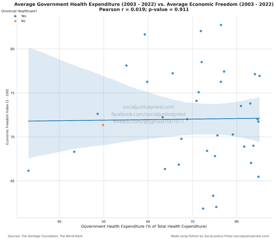
In other words, the government increasing their portion of all healthcare spending has no impact on their economic freedom. I’ll explain more about this in my next entry in the “But What Does the Data say?” series.
Sources:
Munro, R. A., Ramu, G., & Zrymiak, D. J. (2022). ASQ certified six sigma green belt handbook (3rd edition). American Society for Quality.
Vigen, T. (2024, January). Associates degrees awarded in Parks & Recreation correlates with Google searches for “tummy ache” (R=0.98). Tylervigen.com. https://www.tylervigen.com/spurious/correlation/1472_associates-degrees-awarded-in-parks-recreation-leisure-fitness-and-kinesiology_correlates-with_google-searches-for-tummy-ache
Wheelan, C. J. (2014). Naked Statistics: Stripping the Dread from the Data. W.W. Norton & Company.
Enjoying my content?