
Laffer Curve? More Like Laughter Curve!

When arguing with the anti-tax crowd, the argument I hear most often is, “Raising taxes is counterproductive because of the Laffer Curve. The tax increase will cause the government to lose revenue! Look at what’s happening to Europe!” Created by Arthur Laffer in 1974, the Laffer Curve argues there is a “sweet spot” for any given tax rate between 0% and 100%.
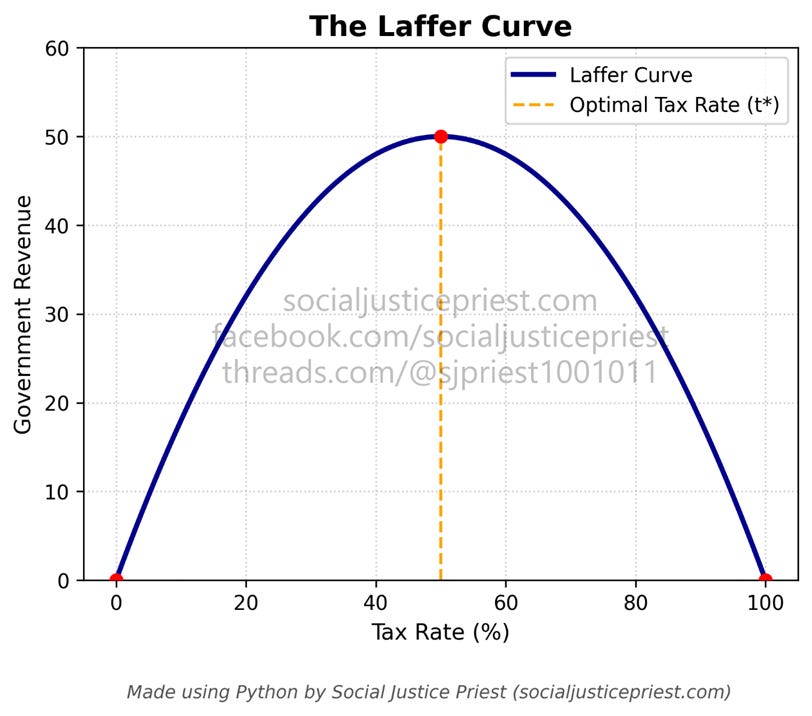
Taxing above or below that rate means the government isn’t maximizing its potential revenue. Although Laffer applied his curve universally to all forms of taxation, its primary political application has historically been leveraged to justify cutting top marginal income tax rates (Fieldhouse, 2013). The most famous example was Ronald Reagan justifying cutting the top marginal tax rate to 28% using the Laffer Curve in the 1980s. Since Reagan, conservative commentators, politicians, and economists have continued to focus on top marginal tax rates and have also used it to argue against most other tax increases. While it makes sense on the surface, the usefulness of this economic theory is questionable at best.
How do we know it’s parabolic?
Proponents of the Laffer Curve claim the reason the Laffer Curve is parabolic because taxing too much causes people to lose their incentive to work. For example, taxing people’s income at a flat rate of 100% would make them stop working since they won’t be able to keep any of their money, leading to the government gaining no revenue. The image I made above is typically how the Laffer Curve is imagined. While it could be argued that people won’t stop working, for the sake of discussion I will assume a 100% tax rate will result in zero revenue collection. The problem is even if we assume government revenue returns to $0 at 100% taxation, that doesn’t prove the Laffer Curve is parabolic!
What do I mean? There are multiple ways to design the Laffer Curve while keeping government revenue at $0 for 0% and 100% taxation.
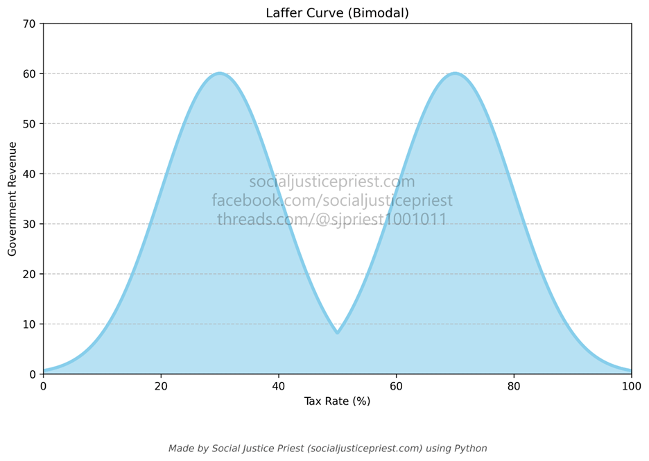
As shown above, the curve could be bimodal. If that’s the case, government revenue would peak at a lower tax rate, taper off in the middle, and peak again at a higher rate. One could argue the lower peak is due to there being one tax rate optimized for motivation and another optimized for revenue. Since the middle of the curve is optimized for neither, it generates less revenue.
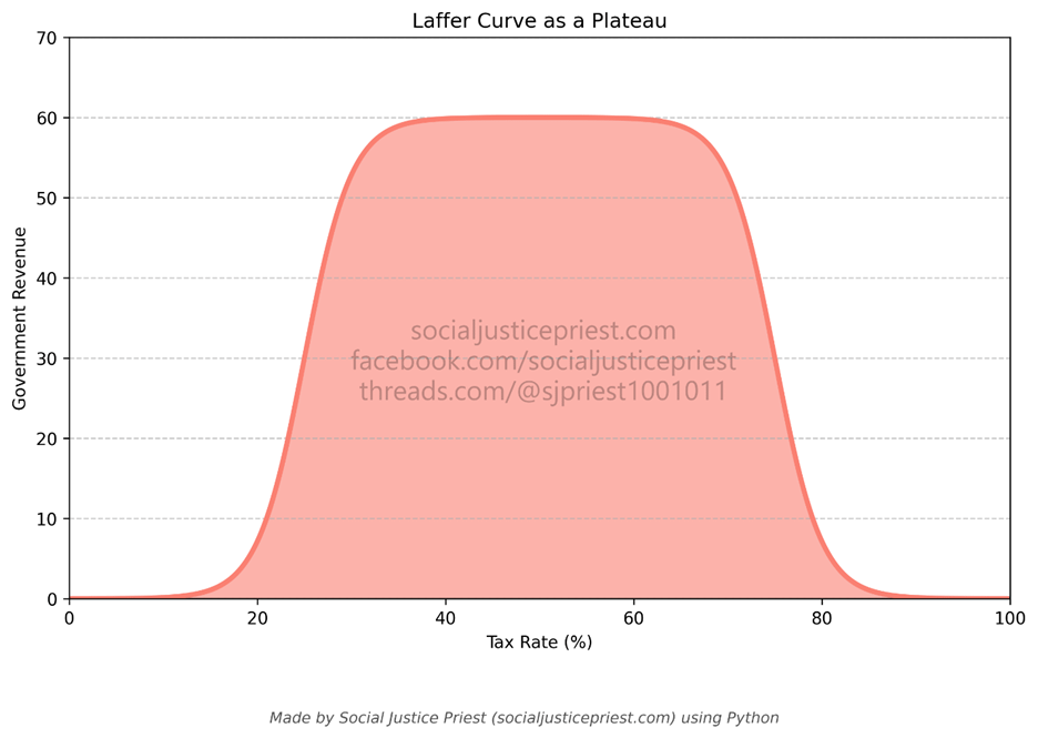
Or it could be a plateau. It’s possible there’s a wide range of tax rates where government revenue is the highest before declining as it approaches 100%. The extra revenue the government collects from increasing the tax rate could cancel out its citizens’ declining motivation to work for those extra dollars before the latter overtakes the former. Another approach based on the Laffer Curve being flatter is spreading the tax burden out over a wider range. If there is a large plateau, then the goal becomes making sure more people pay the existing taxes as opposed to raising tax rates. While conducting research for this article, I found out the Bipartisan Policy Center advocates for exactly this (Lautz, 2026). While I don’t fully agree with their conclusion, it was nice to learn some right-leaning organizations are criticizing the Laffer Curve.
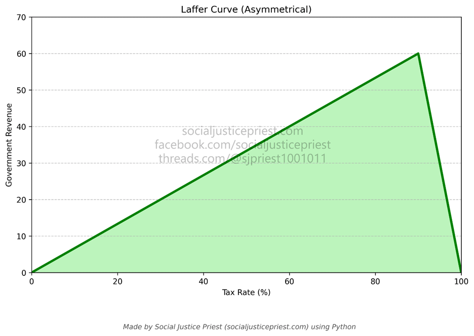
Alternatively, it could be completely asymmetric. It’s possible government revenue steadily rises with the tax rate before sharply dropping off near 100%, like a cliff. Based on what I learned in business school, there are two different types of motivation: extrinsic and intrinsic. Extrinsic motivators are rewards like money or gift cards. To quote Alfie Kohn (2018), “Do this, and you’ll get that!” These rewards are limited based on what a company is able to provide. Intrinsic motivators are more abstract. Self-fulfillment, worker autonomy, and belief in the “mission” of the company are examples of intrinsic motivators. They’re potentially infinite (Lefton & Buzzota, 2004).
Extrinsic motivators are limited in their effectiveness. Not everyone is motivated by money. In fact, money becomes even less of a motivator as people’s financial needs are met (Kohn, 2018). One could argue if the government uses the revenue it collects to meet people’s needs, it could keep increasing tax rates before people’s motivation to work harder starts to disappear. If I were to accept a version of the Laffer Curve, it would be one like the model presented above.
I want to emphasize the three different Laffer Curves above are all purely speculative. That said, even a parabolic relationship could be skewed to the left or the right, which brings me to my next point…
Where’s the peak? Nobody knows!
The real problem with the Laffer Curve is not what happens at the beginning or end of the curve, it’s that no one can agree on what happens in the middle!
In the first graph I provided, and multiple other versions available on the internet, the optimal tax rate is labeled as “t*.” Why doesn’t it have a number associated with it? Because no one knows what it is!
Anti-tax politicians love to cite the Laffer Curve as justification for lowering taxes. They claim the current top marginal tax rate is too high, and we could make more money by giving people back more of the money they make. The logic behind it is the same logic behind Reaganomics: “Trickle-Down.” Conservative/Neoliberal economists argued lowering taxes meant companies could afford to give people more jobs, which would provide the government with a larger pool of workers to tax. What we saw instead was the concentration of wealth at the top.
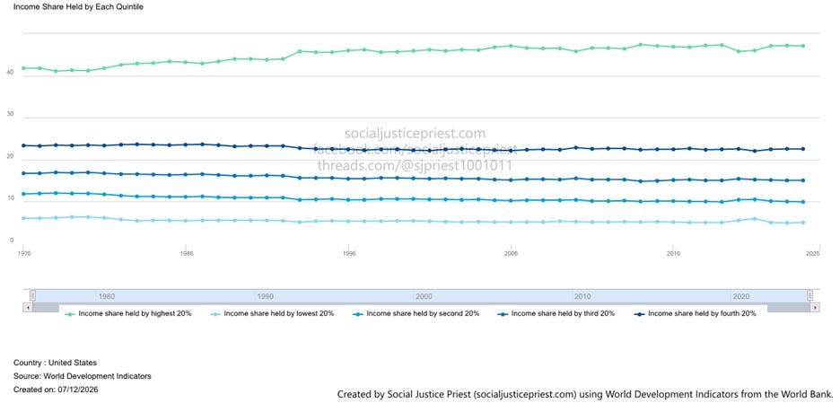
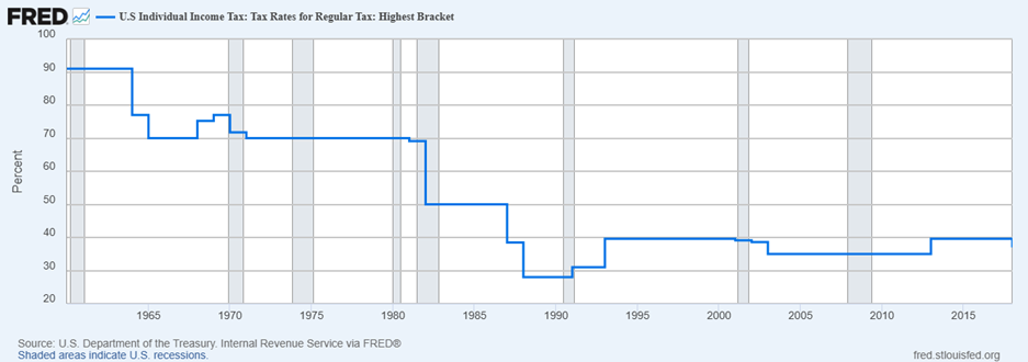
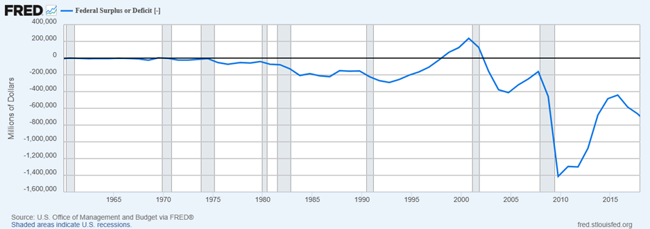
Like I said in my “Correlation vs. Causation” article, correlation isn’t causation. However, the correlation between lowering the marginal tax rate with rising income inequality and the increasing federal deficit makes an argument against the belief that lowering taxes generates more revenue. If the Laffer Curve is real, one could argue tax cuts of the 1970s, and definitely the 1980s, put us on the left side of the peak.
The Laffer Curve Isn’t Universal
Unlike what many proponents of lower taxes claim, there isn’t just one Laffer Curve. Different Laffer Curves apply to different types of taxes and in some cases differently based on who is paying that tax. For example, the Laffer Curve would be different for value-added taxes on luxury goods like yachts or certain cars than one for value-added taxes on items like food. People who can afford to buy yachts or fancy cars can afford to avoid taxes by purchasing them overseas and either just paying any import costs or simply only using them when they travel to other countries. For food, most people purchase it nearby and are rarely willing to travel to buy it just to avoid taxes. Depending on where the person lives, the commute to where the taxes are lower costs them more than just paying the taxes!
The Laffer Curve is ultimately a misdirection
I’m about to say something that might be confusing given the graphs above: marginal tax rates don’t matter that much. Before I explain why, let’s be clear about what the Laffer Curve was meant to do.
Laffer created the Laffer Curve to support the following hypothesis:
The plot of a tax rate of a country vs. the total revenue the government earns from that tax is an upside-down “U” with a peak.
A country’s workers would lose their motivation to produce more as their total tax burden approached 100%.
The government will lose money despite increasing taxes if enough people refuse to work, which is why the revenue decreases once the tax rate reaches a certain percentage.
Therefore, it’s important to make sure tax rates stay as close to the peak as possible.
Many conservative proponents of the Laffer Curve have added to Laffer’s hypothesis:
The current marginal tax rate is still too high.
High marginal tax rates negatively impact economic growth.
While it’s most important to reduce central/federal government marginal taxes for the wealthiest members of country, taxes at every level (federal, state, and local) negatively impact economic growth.
Therefore, the goal is to cut taxes as much as possible and keep them low to promote economic growth.
The conservative focus mostly on marginal tax rates is misleading. What really matters is how much revenue the government can collect. For example, the wealthiest Americans faced a top marginal tax rate of over 90% in the 1950s, but their effective tax rate was only 42% (Greenberg, 2017; Steinbaum, 2017). (To be fair, that’s still much higher than it is now.) Tax loopholes and deductions allowed people to avoid the higher tax rate. One of the ways the owner class avoided these taxes was putting most of their revenue back into their companies and employees as opposed to keeping it as profits. To drive this point home, let’s look at a heatmap.
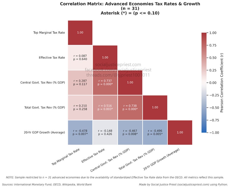
Because of the missing country data for the “Effective Tax Rate” category (see note in above heatmap), I’m restricting the dataset to the 31 advanced economies with complete records across all categories of data. As stated in my “Hypothesis Testing” article, I will be evaluating statistical significance against a threshold of alpha = 0.10 (p <= 0.10) to avoid false negatives.
Based on the heatmap above, there’s no statistically significant correlation (p > 0.10) between the top marginal tax rate (Top Marginal Tax Rate in the heatmap) and total tax revenue (Total Govt. Tax Rev (% GDP) in the heatmap) or central/federal government tax revenue (Central Govt. Tax Rev (% GDP) in the heatmap), challenging the conservative add-ons to Laffer’s hypothesis. However, there’s strong correlation between the effective tax rate and central government tax revenue (r = 0.737; p < 0.10). Many conservatives focus on top marginal tax rates, but it’s the effective tax rates that have a relationship to central/federal government revenue. The same can be said for total tax revenue (r = 0.516; p < 0.10) It’s not the maximum tax rate that matters, it’s how much money the government collects! This is further reinforced by the lack of correlation between the top marginal and effective tax rates (r = 0.087), and the lack of a statistically significant relationship between top marginal tax rates and the central and total government tax revenues. In other words, there’s no data supporting the Laffer curve accurately describing how top marginal tax rates affect government tax revenue.
I’m not saying the Laffer Curve doesn’t have any truth to it or can’t be modified to become more robust. What I’m saying is the existing Laffer Curve is useless for arguing lower taxes increase government tax revenue.
But what about the other additions to Laffer’s hypothesis?
As stated above, many conservative proponents of the Laffer Curve use it to argue against high marginal tax rates and for additional tax cuts for the wealthy. They believe high (as they define it) marginal tax rates harm economic growth, but is this true? Well…
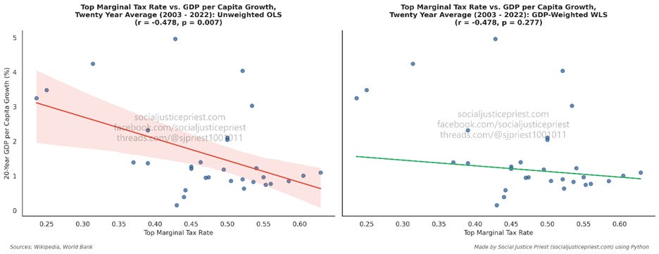
Per the pair of charts above, the ordinary least squares (OLS) regression shows strong, negative, and statistically significant correlation between top marginal tax rates and GDP per capita growth over the last twenty years. While correlation doesn’t equal causality, this does show 47.8% of the movement in GDP per capita growth can be explained by movement in the top marginal tax rates. So that’s it? The conservatives were right and marginal tax rates do harm economic growth. Not so fast, look at the other chart.
Taking a weighted least squares (WLS) regression using aggregate GDP, the statistical significance of the relationship disappears (p > 0.10). Even though the correlation coefficient is the same, the relationship between top marginal tax rates and economic growth becomes statistical noise when weighed against each country’s GDP.
Why is WLS more important? OLS assumes the thirty-one advanced economies I sampled for this article are completely independent of each other. While this is fine for metrics like how much tax revenue a country collects or how much a country spends on healthcare, a nation’s economic growth is affected by other countries. Advanced economies are given their name partially because of the variety of their export and “degree of integration into the global financial system” (International Monetary Fund, 2026). The interdependence of the advanced economies means they can’t be treated like isolated entities. Larger economies like the US and Japan are going to have more of an impact on worldwide economic growth than smaller economies like New Zealand and Luxembourg. This is why the WLS provides a more accurate picture than OLS.
I’ve established that the marginal tax rate is a misdirection due to having no statistically significant relationship with central/federal government revenue and almost nonexistent correlation with total tax rates (federal, state, and local), and effective tax rates. I’ve shown how effective tax rates have a stronger relationship with government revenue. But is there a relationship between the effective tax rate and GDP per capita growth?
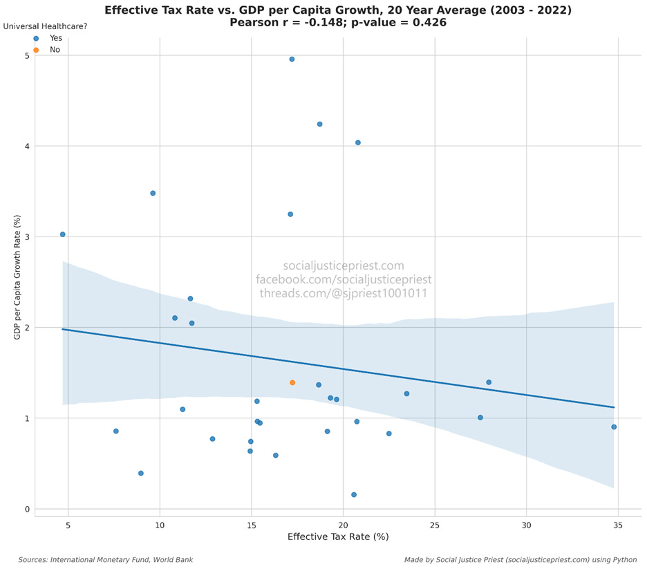
As shown by the correlation coefficient (r = -0.148) and p-value (p = 0.426) there’s no statistically significant relationship between a country’s effective tax rate and how much its GDP per capita grows.
While that answers the questions about tax rates, what about tax revenues? As shown in the heatmap, there’s strong negative correlation between the amount of revenue the government collects (as a % of GDP) and GDP per capita growth. Taking this fact by itself, it refutes the Laffer Curve because a strong downward trend is not parabolic, but does it mean collecting more taxes ultimately hurt economic growth? No. As I said, correlation isn’t causality and there is one more strong relationship to consider:
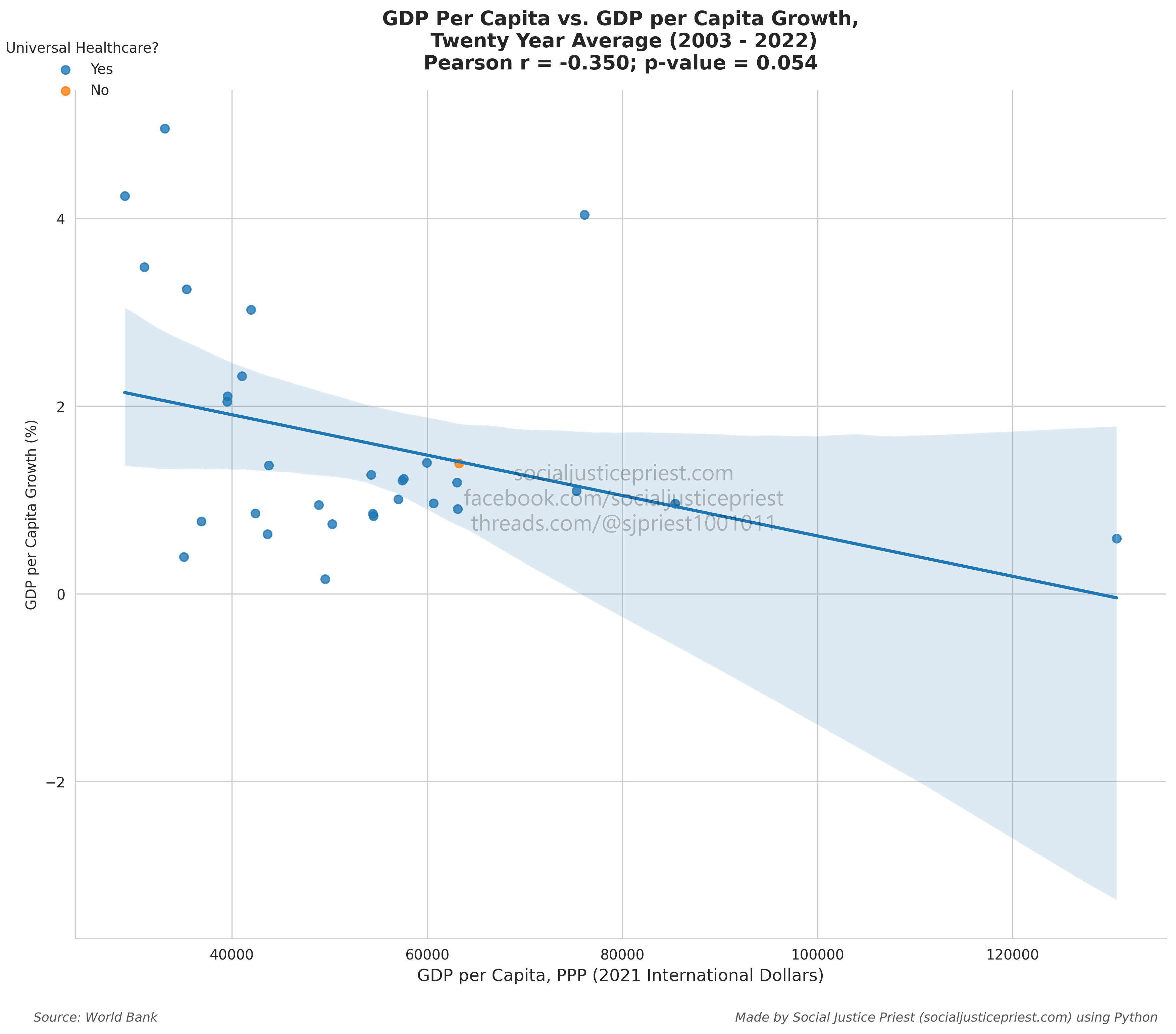
As shown above, GDP per capita is negatively correlated with GDP per capita growth. This is a well-known phenomenon known as economic convergence. As a country gets richer, its growth starts to slow. Additionally, countries with more economic output can collect more revenue from taxes. This explains the relationship between government revenue and economic growth rates.
With the refutation of both Laffer’s original hypothesis and the claims frequently added by conservative commentators and politicians, there is one last question left to ask…
Is the Laffer Curve even a curve?
Proponents of the Laffer curve will argue everything I’ve said here is invalid because linear regression can’t accurately determine correlation for a curve. This is a fair point. If the Laffer Curve is really a curve (parabolic or otherwise), linear regression will deliver inaccurate r and p values. The solution? Use nonlinear regression to see if a curve actually exists.
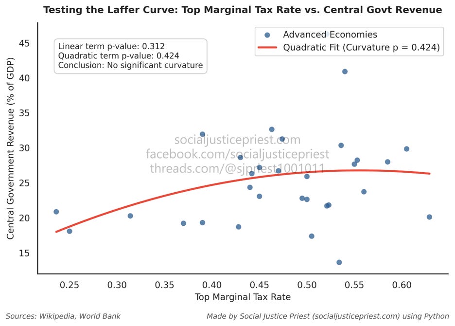
The above nonlinear regression returns two large p-values (p = 0.312; p = .424). Therefore, there’s no evidence supporting the Laffer Curve being a curve. The linear regression models hold. Despite all this, maybe the conservatives are on to something. Maybe taxes are bad. If so, what can we do about it?
If ending taxation is the real goal…
Taxes are an inevitable part of living in modern society. While roads, safe medicines (or safer, at least), building codes, and radio frequency bands may seem boring or mundane, they’re important parts of the infrastructure we all need to live, work, and operate in society. The government needs money to pay for building and maintaining that infrastructure…under capitalism.
The reason we’re forced to debate worthless models like the Laffer Curve in the first place is because capitalism inherently relies on extracting wealth from the working class to function. The best way to manage a broken system is to get rid of it entirely. That means abolishing capitalism and, eventually, money in general!
Capitalism requires money because money is a necessary component of class. Socialism and communism don’t require class to operate and therefore don’t require money. In fact, communism requires a moneyless society to exist. The way to stop worrying about the Laffer Curve, or taxes in general, is to abolish money. That will require getting rid of the economic system that depends on it!
Sources:
Fieldhouse, A. (2013, April 2). A review of the economic research on the effects of raising ordinary income tax rates: Higher revenue, unchanged growth, and uncertain but potentially large reductions in the growth of inequality. Economic Policy Institute. https://www.epi.org/publication/raising-income-taxes/
Greenberg, S. (2017, August 4). Taxes on the Rich Were Not That Much Higher in the 1950s. Tax Foundation. https://taxfoundation.org/data/all/federal/taxes-on-the-rich-1950s-not-high/
International Monetary Fund. (2026). World Economic Outlook (WEO) - Frequently Asked Questions. World Economic Outlook (WEO). https://www.imf.org/en/publications/weo/frequently-asked-questions#4q2
Kohn, A. (2018). Punished by Rewards: The Trouble with Gold Stars, Incentive Plans, A’s, Praise, and Other Bribes. Houghton Mifflin Company.
Lautz, A. (2026, March 6). What a new Laffer curve paper tells us about raising taxes. Bipartisan Policy Center. https://bipartisanpolicy.org/issue-brief/what-a-new-laffer-curve-paper-tells-us-about-raising-taxes/
Lefton, R. E., & Buzzotta, V. R. (2004). Leadership Through People Skills. McGraw-Hill.
Steinbaum, M. (2017, August 8). Effective Progressive Tax Rates in the 1950s. Roosevelt Institute. https://rooseveltinstitute.org/blog/effective-progressive-tax-rates-in-the-1950s/
Graph data sources provided on the graphs themselves (if applicable).
Enjoying my content?