

Context matters. If you grew up in the South like I did, you were fed a steady diet of American Exceptionalism. Not only were we Leader of the Free World, but we were the best at everything. Science, social policy, race relations, healthcare, economics. If it was a thing, we were #1! Oh, and Martin Luther King ended racism and was shot (passive voice here intentional) right after his “I Have a Dream” speech. But what does the data say?
America is 250 years old today, and we’re far from exceptional. We have a dark history of colonialism and imperialism. We’re currently funding Israel’s genocide of the Palestinians, starving Cuba with a military blockade, and our President is a rapist (Pengelly, 2023). Despite all that, I still love my country. That’s why I make these posts and engage in other forms political activism: to improve the United States (US).
Before we can start improving, we need to know where America stands.
All these graphs will focus on the thirty-seven countries classified by the International Monetary Fund (IMF) to be advanced economies (International Monetary Fund, 2023, 2026). They’re also developed countries by the United Nation’s (UN’s) Human Development Index (HDI). I omitted Puerto Rico, Hong Kong, Macau, and Taiwan. While they’re classified as advanced economies, they’re part of other countries (the US and China, respectively).
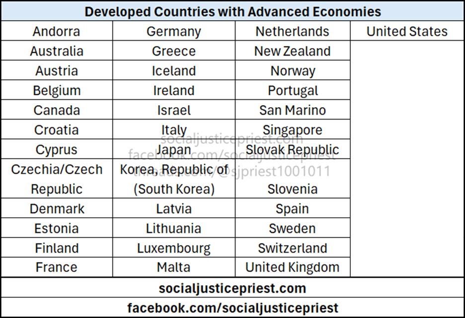
I chose these countries to try to be as fair as possible. It’s easy to make any developed country look good when comparing it to a developing one, but how does America rank among its peers?
I will only be providing national rankings and benchmarks for this article. My goal is simply to show where America stands, not to perform a deep-dive bivariate analysis. The US will be red, every other country will be blue. The black dotted line going through each graph represents the median of all the measured countries. Without further delay, on to the data!
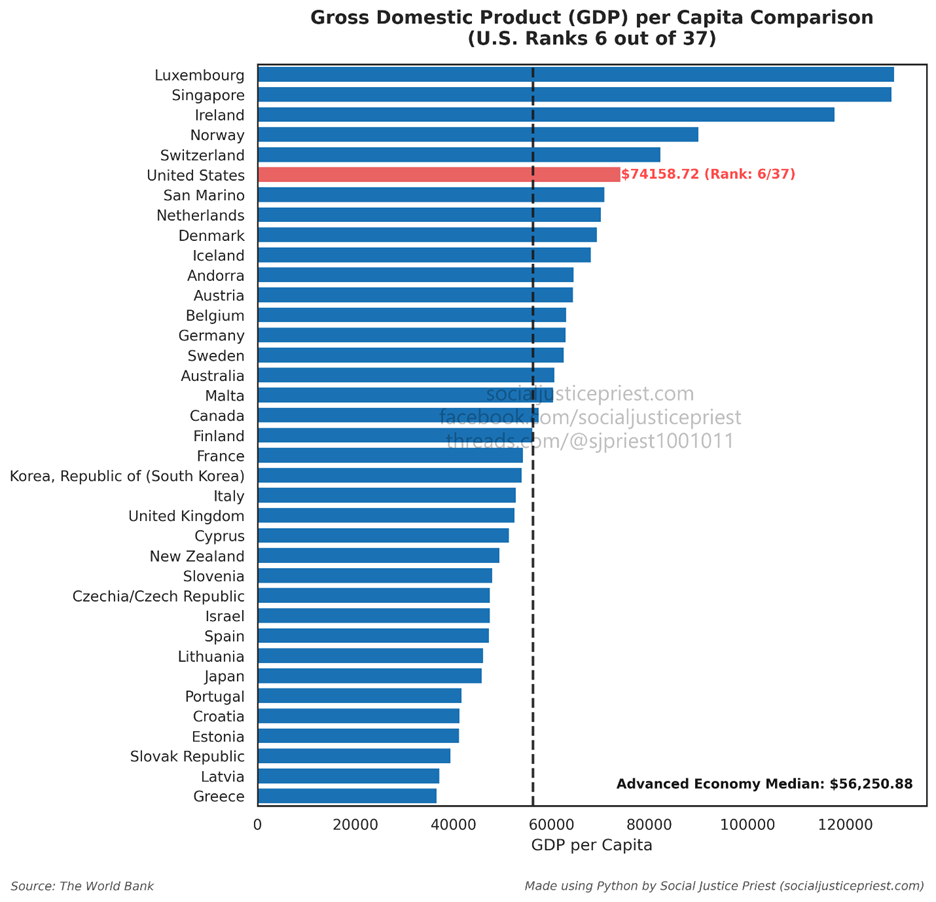
Gross Domestic Product (GDP) per capita is the “universal” benchmark for a country. GDP per capita measures the economic output per citizen by dividing a nation’s GDP by its population, thus eliminating the latter as a variable. Large countries like the US, India, and China can be compared to small countries like Andorra, Singapore, and San Marino. Economists, sociologists, statisticians, and health professionals consider this a best-all-around indicator of a country’s prosperity. That said, it’s not a perfect measurement. The GDP doesn’t account for economic inequality within a country or give a complete picture of the quality of life (Ball, 2023). For example, all other things being equal, a country where people work twelve hours a day will have a higher GDP per capita than a country where people work eight hours a day, but most would argue the people working only eight hours have a higher quality of life than those working twelve (Mankiw, 2024).
The HDI addresses some of the shortfalls with GDP per capita. As stated above, the HDI is a UN metric that takes education, life expectancy, and Gross National Income (GNI) and scales it to a number between 0 and 1 (United Nations Development Programme, 2026). The higher the number, the more developed a country.
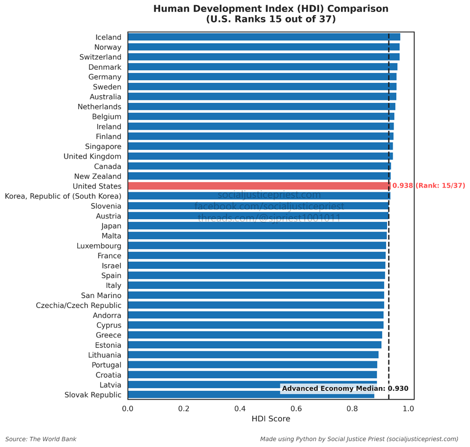
Instead of looking purely at economic output, the HDI factors in quality-of-life measurements like education and life expectancy. It uses GNI instead of GDP because that focuses only on the revenue a country generates from its citizens/residents and not the money brought in from people using that nation as a tax haven. Despite these improvements, the HDI fails to address income inequality. That’s where the Gini coefficient comes in.
The Gini coefficient measures income equality within a country on a decimal scale from 0 to 1. The lower the number, the more equal the country (Hasell, 2023).
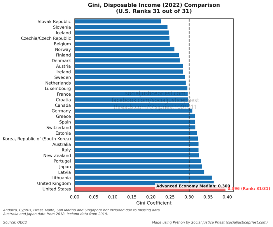
As shown in the chart, America is the most unequal of the advanced economies.
The Gini has its own set of limitations. It doesn’t consider a country’s development level, and it can’t explain why inequality exists. Two nations could have the same Gini coefficient with different levels of prosperity. That’s why it’s important to examine more than one metric when determining a country’s global stance!
One thing I’ve always heard growing up is taxes are bad. High taxes lead to lower economic output, a lower quality of life, and less economic freedom. Our low taxes were described as the reason why we had the “best economy in the world” and why we “far surpassed Europe” in quality of life. As shown by the GDP and HDI graphs above, those claims are questionable at best. But at least we have lower taxes than everyone else! Well, almost…
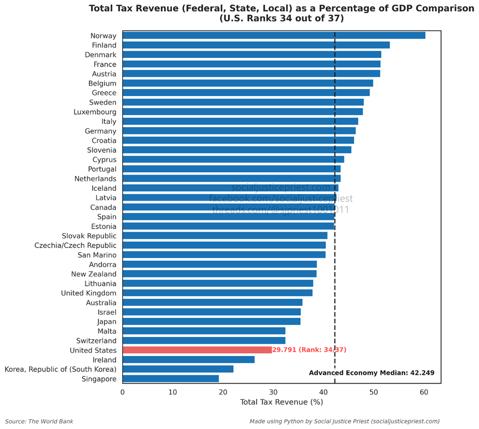
One of the pitfalls of the “low taxes” argument is people fixate on marginal tax rates. I include myself in this because until I started doing the research for this series, I was one of them! In reality, marginal tax rates don’t tell us how much a country is collecting. For example, America’s maximum tax rate was above 90% in the 1950s, but very few people actually paid that amount due to loopholes and deductions. That’s why tax revenue as a percentage of GDP is important: it explains how much money the government collects from taxes. As shown above, America is towards the bottom. As I will explain in my upcoming article on taxation, that’s not inherently a bad thing.
This is the part where people on the right will say, “Exactly! America’s low tax rate is why we have the highest annual income in the world!” But do we really?
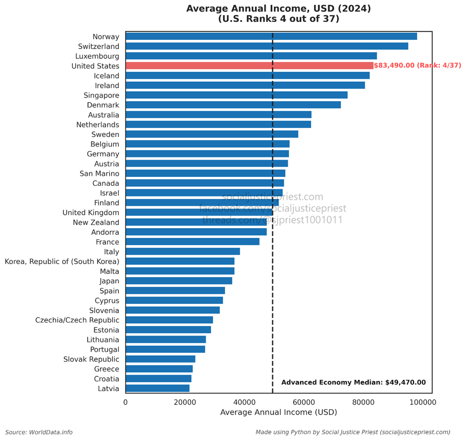
Ouch! But at least everyone has home. Wait, don’t tell me…
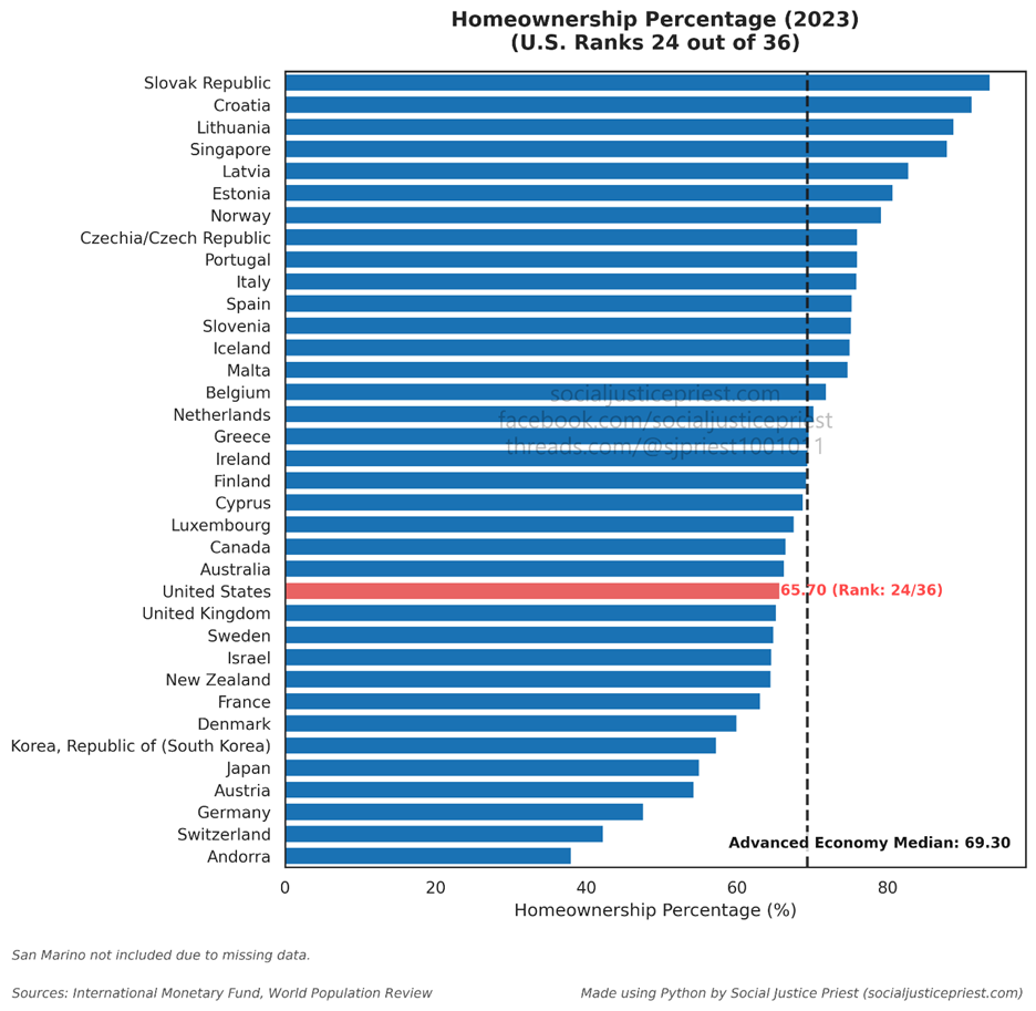
America is in the bottom third for homeownership. This one surprised me a little. As I will cover more in depth in a later article in the series, America has the cheapest homes of any advanced economy. This provides another example of why looking at more than one metric is important. Looking solely at GDP per capita, America is one of the richest nations in the world. I plan to dive deeper into it in another article, but this shows America doesn’t have a wealth generation problem. We have a wealth distribution problem, which is exactly the kind of problem socialists like me wish to solve!
So far we’ve learned America isn’t the richest, isn’t the most developed, isn’t the most equal, isn’t the country with the lowest taxes, isn’t the highest annual income per capita, and isn’t the country with the highest percentage of homeownership. But we still have the most economic freedom, right? Right? I’m sorry…
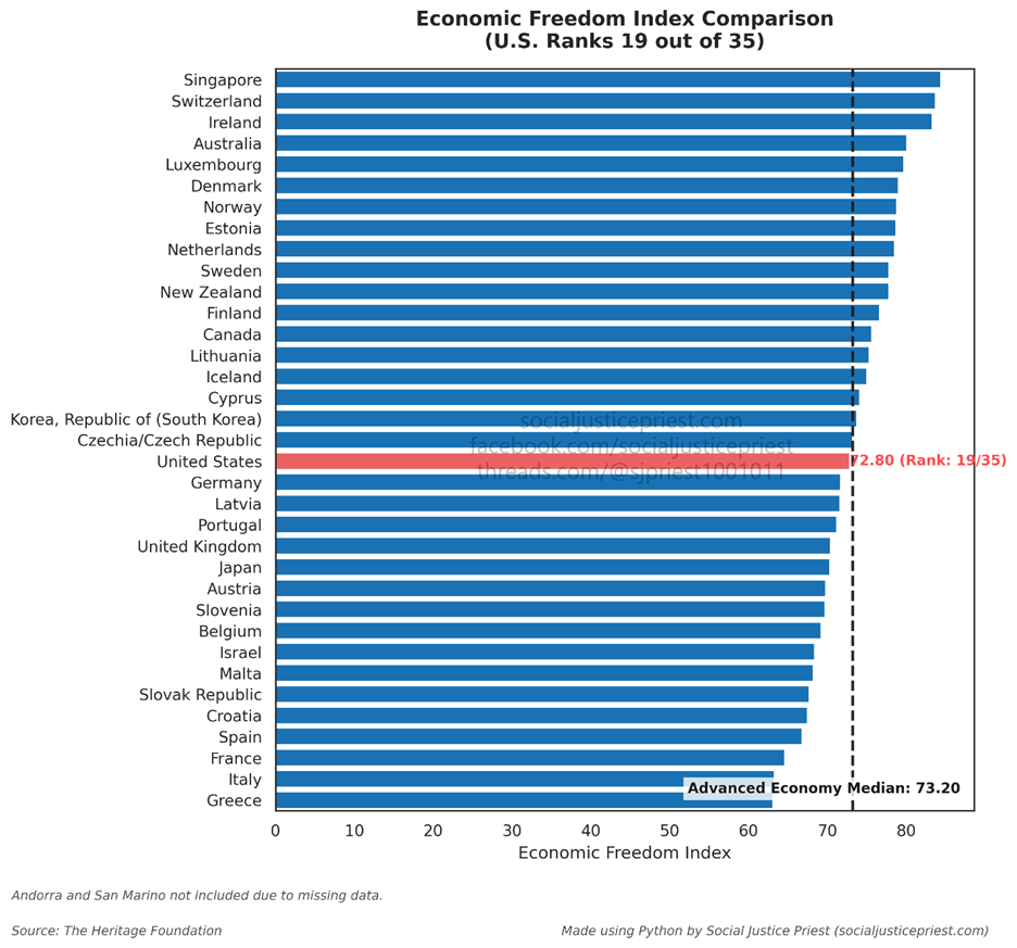
This one is probably going to get me in trouble. As shown above, the Heritage Foundation created the Economic Freedom Index. Yes, the reactionaries who invented Project 2025 are considered a global authority on economic freedom. (Yay, capitalism!) They based their assessment on twelve different measurements grouped into four categories: rule of law, government size, regulatory efficiency, and market openness (The Heritage Foundation, 2026). As shown in the chart above, we’re not even in the top ten among advanced economies.
Before I get to the last part of this article, I want to address something I hinted at in the second paragraph. I’m not using this article to make any moral judgements about America’s actions. The First Principle of Unitarian Universalism is respecting “the inherent worth and dignity of every person” (Unitarian Universalist Association, 2026). I believe America’s actions, both internationally and domestically, are in violation of this principle. While I have moral disagreements with the way the country is being/has been run, this article isn’t meant to justify that position. Conversely, some will argue that America is the greatest country in the world because of [insert moral value(s) here]. They’re entitled to their opinions, but this is about the data. The data states, based on multiple objectives measures, America is not the best country in the world. Again, some people may argue the metrics I picked are irrelevant, but the burden of proof would be on them to explain why they believe those metrics are useless.
Finally, as some might have guessed, each graph I posted has a twist. The US is red and all the other countries are blue. While that makes where America stands more obvious, that’s not the only reason I chose to make the US a different color. In every graph, the US is the only country that doesn’t have universal healthcare. (San Marino has full access to Italy’s system.) My next article will explain, using data and bivariate analysis, how not having universal healthcare negatively impacts our rankings.
Sources:
Ball, J. A. (2023). The Myth and Propaganda of Black Buying Power: Media, Race, Economics. Palgrave Macmillan, an imprint of Springer.
Hasell, J. (2023, June 30). Measuring inequality: What is the Gini coefficient?. Our World in Data. https://ourworldindata.org/what-is-the-gini-coefficient
The Heritage Foundation. (2026, February). Index of Economic Freedom: The 12 Economic Freedoms. Index of Economic Freedom. https://economicfreedom.heritage.org/pages/report#indexTwelveFreedoms
International Monetary Fund. (2023, April). World Economic Outlook Database - Groups and Aggregate Information. World Economic Outlook Database. https://www.imf.org/en/publications/weo/weo-database/2023/april/groups-and-aggregates
International Monetary Fund. (2026). World Economic Outlook (WEO) - Frequently Asked Questions. World Economic Outlook (WEO). https://www.imf.org/en/publications/weo/frequently-asked-questions#4q2
Mankiw, N. G. (2024). Principles of Economics. Cengage.
Pengelly, M. (2023, August 7). Judge says E Jean Carroll allegation Trump raped her is ‘substantially true’ in court dismissal. The Guardian. https://www.theguardian.com/us-news/2023/aug/07/donald-trump-rape-language-e-jean-carroll
Unitarian Universalist Association. (2026). Seven UU Principles. Unitarian Universalist Association. https://www.uua.org/beliefs/what-we-believe/principles
United Nations Development Programme. (2026). Human development index (HDI). UNDP. https://hdr.undp.org/data-center/human-development-index
Chart data sources are listed on the charts themselves.
Enjoying my content?
Well done again!
Splendid work dotting data I's and crossing info T's.
I think I've encountered most of it before but never all in one place, which is really cool, and while I've heard of the Economic Freedom Index, I had no idea that it was a Heritage Foundation creation (which makes it rather sus to me, considering their behavior).